You should see the above snapshot on clicking on templates.
Their are many blogger templates but each have something unique about it. But i'm going to be discussing about just two basic features i discovered about these templates. A choice you should be making before ever
selecting any template for designing. And yes, i won't be talking about dynamic views any way. I don't like them. The template is just the opposite of it's name.Though it's pretty stylish, you are not allowed to play around/design/pimp, you know are not the real owner of your template like other ones. It's just structured and static. You'er allowed to but select it,that's all. unlike others where you can do almost any how,as to designing and been a bit creative. By the way, Bloggerdemmy uses Blogger default template
selecting any template for designing. And yes, i won't be talking about dynamic views any way. I don't like them. The template is just the opposite of it's name.Though it's pretty stylish, you are not allowed to play around/design/pimp, you know are not the real owner of your template like other ones. It's just structured and static. You'er allowed to but select it,that's all. unlike others where you can do almost any how,as to designing and been a bit creative. By the way, Bloggerdemmy uses Blogger default template
Now the two basic dissimilarity i said i was gonna get you exposed to:
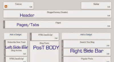
I think i should show you some things in the layout for a clearer understanding of this distinction i have in mind to put you through
This the snapshot of blogger layout. You can just open it to have a natural view. Now, see those areas i highlighted with blue tags/titles? Those are blogger names for those sections, but they are common features of every website you see. Although like in the houses we live in, some architects might add some designs, but a house is a house. That section, where the websites/blogs name is written is known as the header. Where the categories of concerns/products/items/articles these blogs write about/deal on are seen just below the header is known as tabs, while everything at the middle of the blog page is the body of the blog,that's where all written items/uploaded products are seen the way you published it by visitors. The both sides of every blog is know as the side bars,though many blogs do not always use or fix anything at the left side bar,as you can see,bloggerdemmy did. Look our page again and see that our archive is on the left side of the page, like in the above snapshot, just below where i wrote, LEFT SIDE BAR.
So that's a slight overview of how this thing looks like from inside and how yours will equally appear and also how it defines how outside will appear. About the navbar and favicon, they don't really matter. Though i have thoroughly solved blogger layout(search it up using our search button) . Including the vast of contents that you also see just down the web page( that's below everything in the above snapshot, I cut it half, actually their are things that should be at the bottom of it(Footer) You can also revisit bloggerdemmy and scroll, i around think you should see my Profile at that area.
Like i said before, the above chap is a mere preface to the two templates differences i want to be discussing
Now, Take a look at this snapshot:
Or click Here to see the site in full. Unlike facebook google and every other website out there, this header did not start from the uppermost of the blog body. See that it's(the header) a bit below the topmost end of the page upwards? Yes. This is one unique thing. Lets see the second one which is just the opposite
But see bloggerdemmy header, it started from the uppermost end of the pages' entire body.Both are default
blogger templates . Picture window template has four in it, the former here is the first one while the later is the 3rd
Do you also see what i mentioned earlier about header and tabs/pages? Header been before the tabs and containing blogs name while tabs houses pages' category.
As for template, chose anyone Apart from dynamic views.
Kindly Share this article if it solved your problem
Kindly Share this article if it solved your problem


